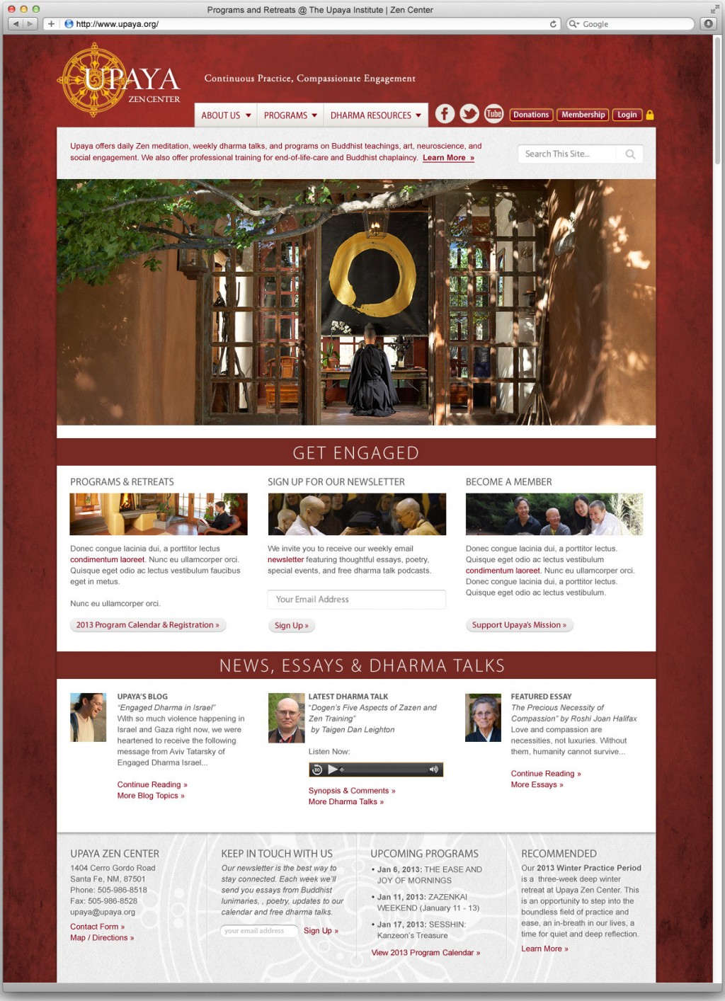
I’ve had the pleasure and good fortune of being Upaya’s webmaster since 2007, when they first asked me to modernize their system for registering visitors for meditation retreats and trainings. However it wasn’t until 2013 that we had a chance to completely redesign the look and feel of the website from scratch.
Upaya’s Abbot, Roshi Joan Halifax, wanted a dramatic new look for the site that reflected the intensity of Upaya’s commitment to compassionate engagement. The challenge was to come up with a design that was both bold and welcoming at once.

The 2015 redesign for www.upaya.org
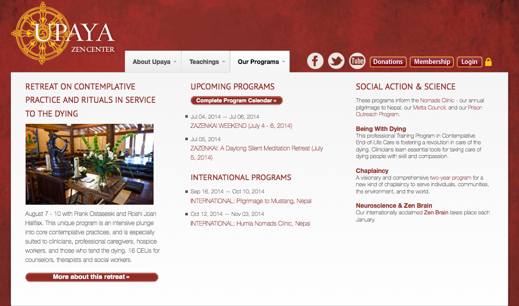
Everyone was in agreement that to accommodate the size and scope of the site, we needed to overhaul our old sidebar-based navigation system. To guide visitors’ attention to the rich resources we made available (such as daily dharma podcasts, videos, teachings, and weekly programs) we implemented a “mega dropdown” menu organized into three easily interpreted tabs: About Upaya, Teachings, and Our Programs.
What I like about mega dropdowns is that instead of trying to organize a website site into a hierarchy of categories and page names (and hoping that those page names make perfect sense to visitors) mega dropdowns give us the opportunity to describe in detail what’s available using text and images:
Meanwhile, behind the scenes, virtually all of the website content was migrated into WordPress so that Upaya’s staff could easily edit any page. My custom PHP/MySQL content management system continues to drive the program calendar, registrations, and fundraising portions of the site since these have been tailored to exactly match Upaya’s business workflow and finance/banking technologies.
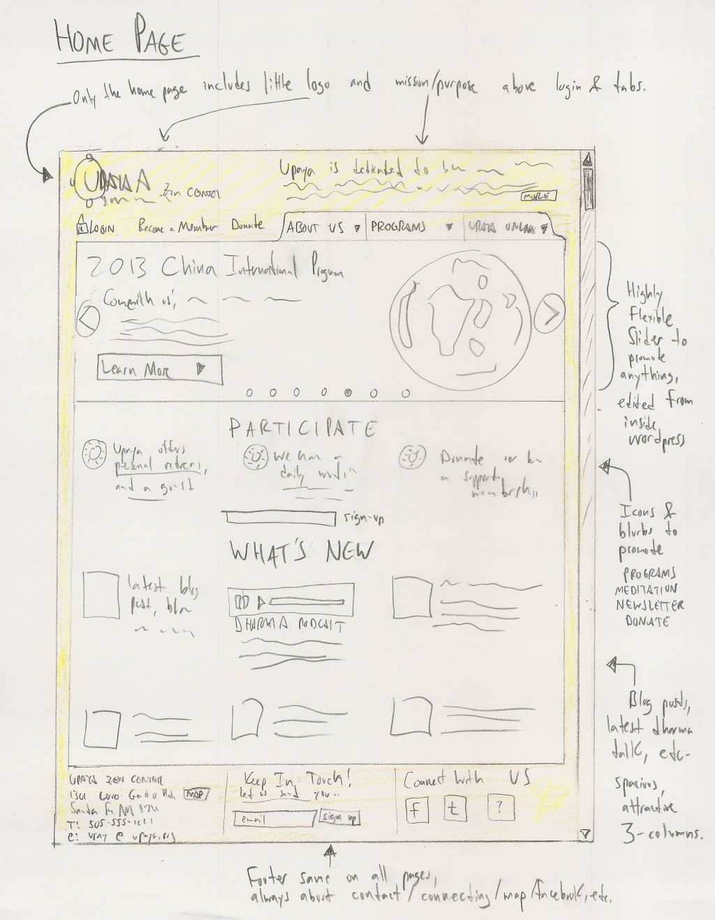
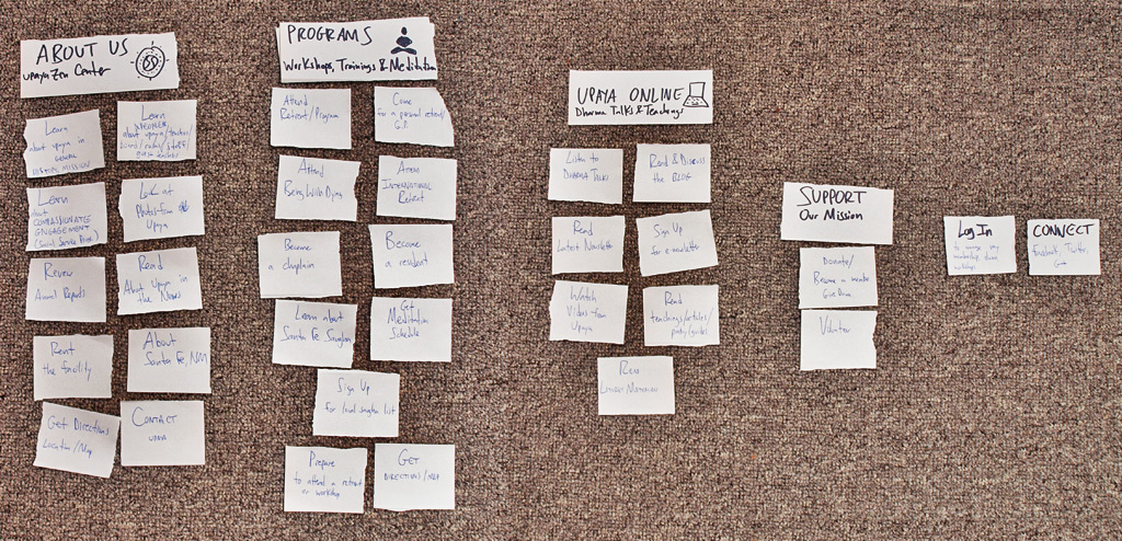
Sketches
This project was slow-cooked over a period of almost a year. Much of the planning was conducted with old-school technology: paper, pen, and real-life meetings. Here’s a sketch and a “bucket list” that informed the ultimate design and navigation for the site:


